A cursory introduction to RANSAC
Outliers
Outliers can cause trouble in fitting models to data. Even simple models: if the numbers 170, 164, 185 and 400 are centimeter measurements of the heights of people, it is obvious that one is an outlier. Computing their mean illustrates the problem – 230 cm is not a good estimate of average human height. One solution would be to compute the median instead.
Outliers are often dealt with by formulating robust versions of the fitting criteria. The median is an example of a robust estimator of central tendency – being defined as the middle sample in the data, it is not affected by the magnitude of the extreme samples. More generally, in regression problems, the least-squares criterion can be replaced with least absolute deviations (LAD) to combat the effect of outliers. This post considers a peculiar robust estimation method, especially popular in Computer Vision, called RANSAC.
Randomness to the rescue
RANSAC stands for RANdom SAmple Consensus. The method works by repeatedly fitting a model to small random subsets of the data, and counting the points that agree with the fit. Here, “agree” means that the point is close enough to the model by some error criterion. The final model is the one that produces the best agreement (the “consensus”).
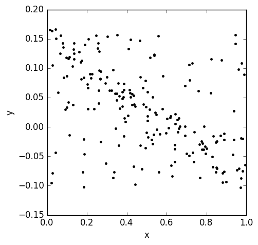
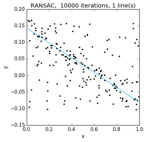
Why does this work? As a simple example, consider data from a line corrupted by uniform noise in a rectangle (left on the figure below). First, assume that our random sample happens to give an excellent fit to the linear data. If the error threshold is reasonable, most points on the line agree with the model, whereas few noise points do. Now, assume that the random sample yields a model not quite parallel to the true line. Because of a lack of structure in the noise, fewer points will agree with the resulting model. Thus, given enough iterations to find a representative random sample, RANSAC will find a good estimate. The figure below on the right, shows the result for the data on the left. Before I continue, a couple of details about this and the rest of the examples: on each iteration, a line was fit to three random points using simple least squares, and inliers were points whose absolute distance to the model in the y-coordinate was smaller than 0.01.
Now, what would happen if the data was corrupted by points from another line? RANSAC could select either one. Of course, this problem is silly, because no method can say which line is correct. But the example reveals a critical assumption of RANSAC: the number of points agreeing with the true model should be larger than the number of points agreeing with any random model. This also means that there should not be too many outliers; otherwise, even in the absence of such “pathological” structure, any model could be selected over the true one.
So what are the advantages of RANSAC over, say, LAD estimation? The most obvious one is that it’s generic: any model and fitting algorithm can be plugged in, as long as they’re accompanied with a per-sample error estimate. I will next discuss another advantage, which was hinted at in the example: RANSAC naturally lends itself to fitting multiple models.
Fitting multiple models with RANSAC
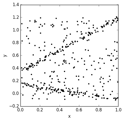
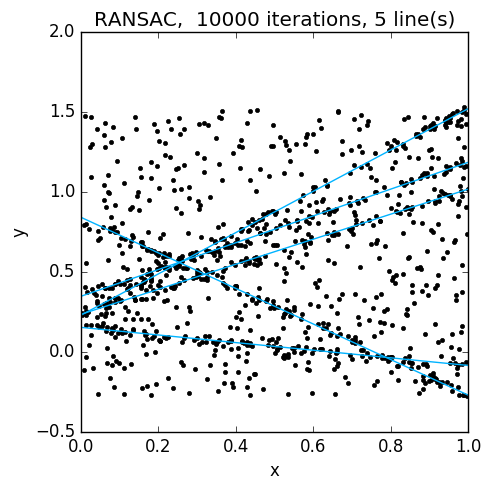
Consider again a case where the data consists of uniform random noise, as well as noisy data sampled from multiple lines, say five. What if, instead of choosing the “consensus” model and calling it a day, we took the 100 most voted models? In the following figures, the data is shown on the left, and the 100 best models on the right:
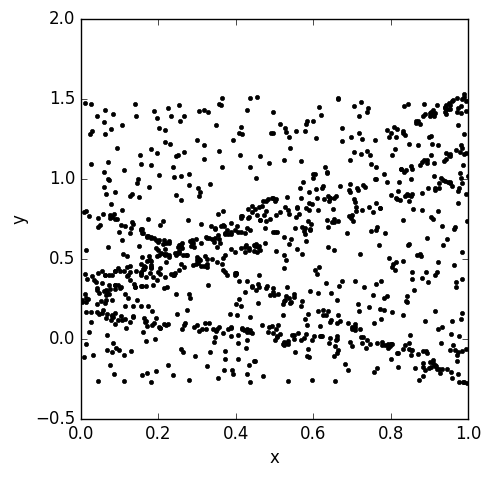
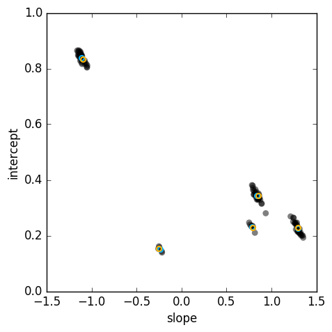
The random models (grey circles) cluster neatly around the true models (cyan circles). From this, it should be easy to find the models using some clustering algorithm. In this example, the orange circles are the result of running the mean shift mode-finding algorithm on the results. Here is the final result:
You may have noticed that this approach ignores some important information: apart from selecting the models with the most inliers, the number of inliers is not used. The number of models we considered was completely arbitrary, and in general would require some thought. Furthermore, the result now depends not only on the parameters of RANSAC, but also on the clustering method and its parameters. I haven’t reviewed the literature to see how far this idea has been developed, but one interesting method is J-linkage; it takes a different approach by clustering together points that agree with the same models.
Music visualization in Python, part 1
This post is the first in a series, in which I plan to document the process of creating a music visualizer in Python using NumPy, SciPy and other libraries that may be needed. The text assumes basic knowledge of Python, as well as the basics of NumPy and SciPy. Some signal processing and image processing knowledge will also be helpful, but not necessary, for understanding the text.
Music visualization
YouTube is a major channel for distributing and discovering new music. Since it is a video streaming service, uploaded music needs to be accompanied with a video. Although it’s perfectly acceptable to create the video from a still image, there is just something hypnotic about a picture that reacts to music.
Now, there is plenty of software that can be used to make beautiful visualizations. This tutorial is all about reinventing the wheel, while creating some visualizations for my own music.
In these posts, I will distinguish two types of visualizations: post-processing effects and drawing-based visualizations. An example of a post-processing effect would be a blur that varies in intensity based on the music signal, and a simple drawing-based visualization would be a bar graph that shows the amplitude spectrum of the audio. In this first post, we will set up the input and output.
Input and output
The first thing we need to set up is IO – we need audio input, image input and
video output. The first two are handled by scipy.io.wavfile and
scipy.ndimage:
import scipy as sp
import scipy.io.wavfile
import scipy.ndimage

(Fs,audio)=sp.io.wavfile.read(audiofile) # Fs is the sampling rate
img=sp.ndimage.imread(imgfile)
For the purposes of this project, we don’t need stereo audio, so let’s convert a stereo signal to mono:
audio=0.5*audio[:,0]+0.5*audio[:,1]For video IO, the most mature library I could find was imageio, which runs ffmpeg and avlib under the hood. We can instantiate a video writer like so:
import imageio
fname='./output.mp4' # the output format is inferred from the extension
fps=30
writer=imageio.get_writer(fname,fps=fps)
Now we can write images to the output:
writer.append_data(img) # append one frame to the video
writer.append_data(img) # append another frame
writer.close() # close when done
The processing loop
We will generate the frames to the video in a for loop. For that, we need the
number of frames, which can be calculated as
N=long(np.ceil(1.0*fps*len(audio)/Fs))And here’s a sketch of how our processing loop will look like:
for k in range(N):
    # extract numeric features from audio used to control
    # the visualization
    ...

    # apply pre_fx
    ...

    # generate drawings
    ...

    # apply post-fx
    ...
To be continued…
So in this post we only covered the boring stuff, but we now have a pipeline set up for creating more interesting things. In the next post, I will discuss what features to extract from the audio, and create a simple visualization. The code for this project, which may not be entirely in sync with the blog, is available on my GitHub.